1960s Decade In Review: Rate the Looks
Well, now we can move on to the next part of this Decade in Review. A long while ago I asked the community to rank each team’s looks over the last decade to find which are the communities favourite and least favourite looks. I received 13 responses, and here are the results.
These first few designs appeared to be some of the most divisive with several of them receiving scores of 8, and obviously lower scores as well.
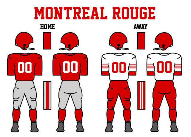
21 - Montreal Rouge (1958-1963)
Score: 48
Average: 3.7
# of 8’s given: 1
Most Common Score: 3
20 - Montreal Rouge (1964)
Score: 49
Average: 3.8
# of 8’s given: 0
Most Common Score: 4
Not too surprised the Rouge’s old looks were low ranked, though I thought the update with silver pants for both would give it a boost, but nope, only a single point separates them.
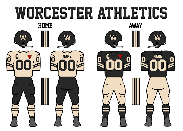
19 - Worcester Athletics/The Athletics (1958-1961/1962)
Score: 54
Average: 4.2
# of 8’s given: 1
Most Common Score: 3
I was never satisfied with the Athletics look, maybe it was the black pants feeling a bit out of the era, but I’m glad some people still like the look.
18 - Pittsburgh Blacksmiths (1965-Present)
Score: 55
Average: 4.2
# of 8’s given: 2
Most Common Score: 4
I’m quite surprised that there were some higher votes for the Blacksmiths as I know that it’s not the most popular look, or maybe that’s my own head not loving the look, but I’m glad some like it.
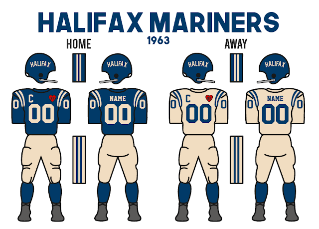
17 - Halifax Mariners (1963-1965)
Score: 56
Average: 4.3
# of 8’s given: 0
Most Common Score: 5
The switch to blue over black certainly helped this look a lot, but yea it was always just okay for me.
16 - Toronto Steelheads (1964-1967)
Score: 57
Average: 4.4
# of 8’s given: 0
Most Common Score: 4
I had one comment saying this was the better Steelheads look, but that’s just a hot take I guess. Overall, the look is fine, again one I didn’t love initially, but that was somewhat intentional.
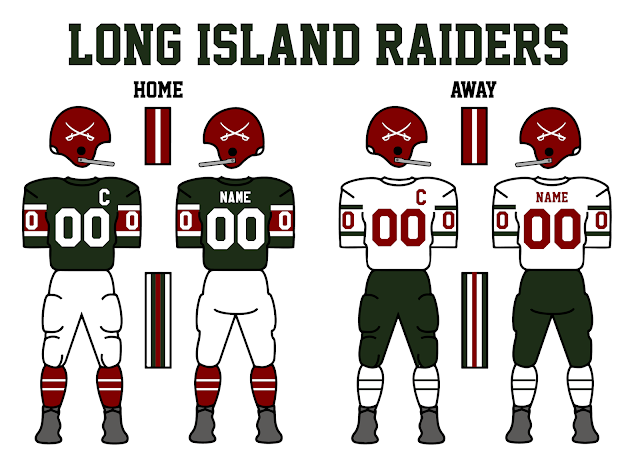
15 - Long Island Raiders (1958-1968)
Score: 59
Average: 4.5
# of 8’s given: 0
Most Common Score: 5
I still find it funny whenever someone realizes that the Raiders are dark green and maroon and not black and maroon. It’s a solid look, I think it might be a bit low personally, but still good.
As we break into the teams with a score of at least 60, we get to some of the honourable mentions for the top 10.
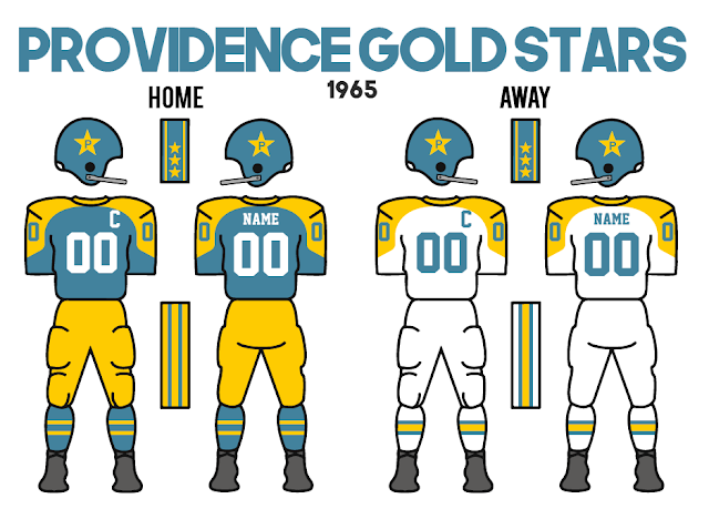
14 - Providence Gold Stars (1958-1963 (without logo on helmet) and 1964-Present (with logo on helmet)
Score: 62
Average: 4.8
# of 8’s given: 0
Most Common Score: 7
The Gold Stars have made their way to 14. They have always had the more “wacky” looks in the league and well I love them for that. Still not sure I would put them above the Raiders, but they are close.
13 - Indiana Victors (1957-1966)
Score: 64
Average: 4.9
# of 8’s given: 0
Most Common Score: 4
Indiana’s original look was also not a favourite of mine. It slowly got worse with time, being busy, but I can see why some like it due to its inspiration being da Bears and that striping being something that people like.
12 - Boston Independents (1958-Present)
Score: 67
Average: 5.2
# of 8’s given: 0
Most Common Score: 5
Boston comes just short of the top 10 with their classic, 3-gold look. (yes, the helmet, pants and striping are all different shades of gold). It’s a classy look that I think still looks good.
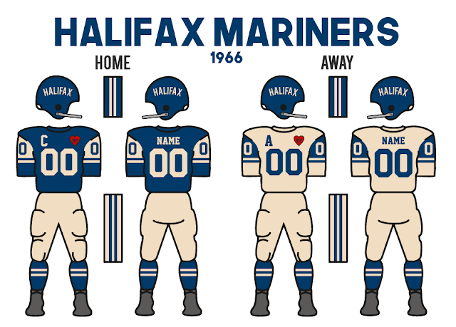
11 - Halifax Mariners (1966-Present)
Score: 69
Average: 5.3
# of 8’s given: 0
Most Common Score: 6
I very much liked the improved Jets-inspired jersey design for the Mariners, just fit better and looked bolder and that clearly came through with it being 6 spots higher than it’s predecessor.
Now to jump into the top 10!
10 - Long Island Raiders (1969-Present)
Score: 69
Average: 5.3
# of 8’s given: 1
Most Common Score: 4
Starting it off we have the recent Raiders update, which saw the road pants change from green to white, and a throwback alternate jersey added to the mix, among other minor changes. I’m kinda surprised to see it that much higher than the other look since it’s not dramatically different, but I guess some like the alternate or just having white pants more.
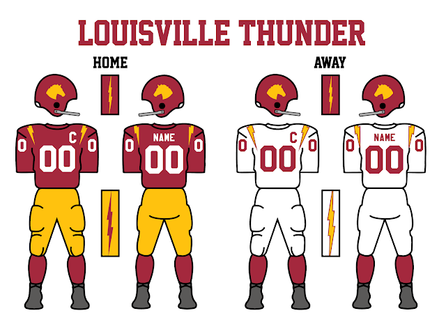
9 - Louisville Thunder (1958-1961)
Score: 71
Average: 5.5
# of 8’s given: 1
Most Common Score: 6
Louisville appears on the list for the first time with its original design. It’s a classic look that works, kind of hard to argue.
8 - Minnesota Serpents (1969-Present)
Score: 74
Average: 5.7
# of 8’s given: 4
Most Common Score: 5
Okay next is… Minnesota? I made these to be a little off and unbalanced on purpose, but it’s up here. Yea I expected Minnesota’s random silver stripe and no blue on the lower half of the jersey to be a bigger problem, but I was wrong! I’m glad this look has been well received with the 4 scores of 8 given.
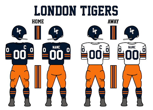
7 - London Tigers (1958-Present)
Score: 78
Average: 6.0
# of 8’s given: 2
Most Common Score: 7
Tigers! Yea this one still remains one of my favourite looks and I’m glad people still love it. I wonder if the orange pants are a bit much sometimes, but It’s a classic look.
6 - Indiana Victors (1967-Present)
Score: 79
Average: 6.1
# of 8’s given: 3
Most Common Score: 6
I was very very happy with the Victors' update in 1967 and I’m glad the community seems to agree. This is one of the biggest upgrades in my opinion and I am very proud of the look and new logo.
5 - Buffalo Blue Wings (1958-Present)
Score: 80
Average: 6.2
# of 8’s given: 5
Most Common Score: 8
On to the top 5, we got the champs of the 1960s, the Buffalo Blue Wings. It’s a classic, and I am not surprised it tied for the most 8 scores out of anyone.
4 - Toronto Steelheads (1968-Present)
Score: 82
Average: 6.3
# of 8’s given: 1
Most Common Score: 7
Another big upgrade came out of Toronto in 1968. It was only simple additions like adding a hint of red and more white and it just makes the look just that much better. Sometimes it’s the small details that make the biggest difference. Another look I am proud of.
3 - Louisville Thunder (1962-Present)
Score: 82
Average: 6.3
# of 8’s given: 5
Most Common Score: 8
The only team to make it into the top 10 with 2 looks, is the Louisville Thunder. Of course, it’s not too fair considering their looks aren’t that much different, but the addition of gold pants on the road seems to have made all the difference in getting this look to the top 3, and being the other team to get 5 scores of 8.
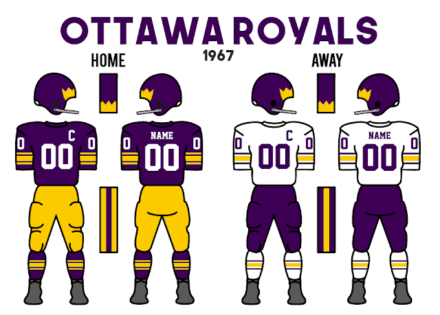
2 - Ottawa Royals (1958-Present)
Score: 83
Average: 6.4
# of 8’s given: 3
Most Common Score: 5
Now down to the last two looks, we have the Royals. This is one of my favourite looks in the league and I think has continued to stand the test of time for me. Ottawa was the only team that had no scores lower than a 5, so most agree that it is a solid look overall.
1 - Montreal Rouge (1965-Present)
Score: 85
Average: 6.5
# of 8’s given: 4
Most Common Score: 6
Finally, we have the top design, which is Montreal’s new update, and I agree heavily with this. I think the Rouge update is one of my favourites I have done, from logo to uniform, it just works so well for me and I love it.
Anyways, thanks to everyone who voted this was fun, feel free to leave thoughts or discuss below! Also, any questions are certainly welcome.











No comments:
Post a Comment