Showing posts with label Teams. Show all posts

Wednesday, 15 February 2023

Winnipeg Falcons


The Winnipeg Football Club was founded in 1921 and would go on to join the WFU in 1927. The team was originally formed under Métis Professor Christophe Adams from Riel University. His son, Louis Adams, would be one of the first star players on the team. They would play their first several seasons at a smaller field near the Manitoba Legislature, but eventually, after the team won their first championship in 1929, Adams was able to pull enough strings to get a stadium built at Riel University named Provencher Park. The stadium would be shared with the school’s college team. In the first couple of seasons in the new stadium, a peregrine falcon nest was discovered within the roof of the stadium. The fans took to the falcons during the difficult great depression, and the team would be renamed the Winnipeg Falcons. The newly named Falcons would capture back-to-back championships in 1936 and 1937. 

Post-WW2, Christophe Adams would slowly pass over the ownership of the team to his son and former player, Louis Adams. Unfortunately, the Adams family was not able to keep up with the financial requirements that the team needed and would eventually sell the team to businessman, Howard Baker, in 1953. The team would go on to win a championship in 1954 under Baker. However, over the next 5 seasons, Baker became disinterested in running the team and decided to sell the team in 1958. At that point, Ed Morrissette would purchase the team. With the purchase by Morrissette, the team returns to its origins, with Morrissette being from the St. Boniface area, where Riel University is located, and being of Métis descent just like Christophe Adams. Since Morrissette took over, the owner has been a steady hand in the organization and the WFU, taking on a level of leadership with his kind and compassionate nature. Winnipeg captured its 6th title in 1960, but the team has struggled to keep up with the juggernauts of Vancouver and Edmonton since then. 

The Team
Jay Nielson leads this team on the field. Nielson was brought in to coach the team just a season ago. He coached for a while at the high school level, winning several provincial titles in Manitoba. He eventually moved up to the Riel University’s Offensive coordinator, where Morrissette decided to pluck him from and put him in charge of the Falcons. Winnipeg has been in need of some direction on the field, as they have some talent, like star WR Terry Upshaw and backfield weapon RB Joe Rivers. They also have a couple of younger pieces like WR Juwan Sylvester and WR Elijah Skinner. Defensively, the team isn’t as strong with only one real star at the moment in LB Claude Clarke. DB Kyle Ellerbee and DL Quinton Hextal are also both solid options, but nothing special. They do have some younger talent in Claude’s brother, Eric on the D-line and LB Kyrell Warner. While the offence does have the stronger set of pieces, the team is not as confident at QB. The team just went through now Wheat Kings’ starter Rusty Lamb and was turning to former Riel QB, Emerson Thompson. Emerson has shown some flashes of solid play but is still sometimes a little off the mark with accuracy, but he’s still young so the team has room to grow with him.

Brand
The Falcons got a light refresh with the Patterson Athletics partnership, mainly just sharpening up the logo and jersey elements.

Logos: The team's logo features a red “W” over top of the overhead shot of a falcon that is in navy. The team had been using something similar up until the update, however, the falcon image was a little sloppier, so Morrissette was glad to have it adjusted. 

Uniforms: The jerseys are pretty simple for Winnipeg. The home is primarily navy with a red falcon on the sleeves. The roads are pretty much the same with just red numbers and blue trim. 

Stadium and Field: As mentioned before, the Falcons share a stadium with Riel University. Provencher Park is on the older side, being built in the 1930s and only seats 23,500. There have been conversations about a new stadium potentially being built, but it’s uncertain about where in the city it will be constructed if it will be on campus grounds or elsewhere in the city. As for the field design, the Falcons will have 2 versions of the field during the season. The one constant will be the team’s “W” located at midfield next to Riel’s “RU” logo. During the early months of the year when only the Falcons are playing the endzones and out-of-bounds lines will be painted. Each endzone featuring the Falcons name and Riel Unviersity. Once Riel starts playing games in the fall, the field will be repainted to be more easily transitioned between Hybrid and Canadian field dimensions. 


Tuesday, 14 February 2023

Vancouver Wolves


The Vancouver Football Club was founded in 1919, with George May as the original owner. May would control the team up until 1934 when he sold the team to Fred Burks. Burks would be a solid leader for the team in his short stint as they would make it to 3 Mackenzie Cups, winning 1 in that time.

After WW2, Burks did not return as owner and the team was transferred over to Arthur Snow. Snow would rename the team the Vancouver Wolves before the first season back in action. The name came from the wildlife of British Columbia, but also the pack-like nature of a football team. Snow would own the team for about a decade from 1946-1955. In 1956, the current owner, Mark Livingston took over the team. The ambitious, young owner brought lots of money into the organization, and it showed. The team captured a title in 1958, and then by 1961, Vancouver would start to rise as a power in the league. They would capture another pair of championships in 1961 and 1964, before getting to their most recent dominance, winning the last 3 Mackenzie Cups. Under Livingston, the Wolves have emerged as one of the best teams in all of football, and one of the most well-run businesses. 

The Team

To no one’s surprise, the Wolves look like the one true contender for the McCallister Cup amongst the WFU teams. Head Coach Johnnie Dawson leads the way with his stoic leadership and masterful mind. Dawson has been regarded as one of the toughest coaches to plan against. On the field, the team is led by one of the greatest WFU QBs ever in Kevin Westwood. Westwood set records for passing yards and touchdowns in the WFU twice over the last 3 seasons. In the backfield, the team has a solid RB in Jeremiah Morrow, along with a stellar set of weapons in WR Keshawn Johnston, WR Ryan Conway, and converted WR to TE Johnny Temple. Defensively, they are just as tough with star DL Rashawn Sutherland, the LB duo of Shawn Anderson and Jaylen Murray, as well as DB Christian Allen. One of the more interesting notes that teams have noticed is several international players are on the team. Vancouver has been doing some scouting overseas and found the popularity of Football growing in Japan. Thus, they have recruited a few players, most notably, WR Akira Sakamoto, whose speed could be a huge problem for defences. Other names include OL Natsuki Ogawa and S Takuya Sasaki, as well as the Chinese-born-Canadian-raised DL Qian Zhou. 

Brand
The Wolves had recently updated their look in the last couple of years, so they are keeping most of the brand intact.

Logos: The logo features an angular head of a wolf, with a pine tree making up the neck fur of the wolf. The tree is, in fact, a team mascot, as there is a tree that is located within the team’s stadium that has been at their home location since before the stadium was built. The fans named the tree Twig and it has stuck. The team colours are still primarily purple and silver, but green is added for Twig.

Uniforms: The team’s jerseys are a classic purple and silver look. The pants and helmet match with silver and a purple-white-purple stripe. The jerseys stripes are similar to the Royals’ sleeve stripes, but with thinner top and bottom stripes with alternating stripe colours in between.

Stadium: As mentioned before, the team’s tree mascot, Twig is a part of the team’s stadium of Vancouver Exhibition Stadium. The stadium has seating all the way around except for the southwest corner which is open. On a small hill in the corner is Twig. The stands have slowly expanded over the years since 1928 to now seat 35,200, making it the largest stadium in the WFU. However, the stadium is getting old, so Livingston is currently in talks about getting a new stadium soon, despite the history that Exhibition Stadium and Twig have. The field is a bit more unique than most with each endzone featuring trees spread across it on a purple background. 

Monday, 13 February 2023

Regina Wheat Kings


The Regina Football Club was founded in 1925, just two years before it made the move to the WFU. The Football Club had replaced a previous Regina team that had stopped operations 2 years before. The team’s founder, Archie Carson, was a great team builder and was able to put together some strong teams with limited talent throughout the 1930s. Unfortunately, the Great Depression would hit Carson and the Football Club. Despite an appearance in the Mackenzie Cup in 1936, the team would fold after the season. 

In 1948, football would return to Regina in the form of the Regina Threshers. Carson was the primary owner for the first couple of years, as he laid the foundation of the team’s only championship season in 1951. However, Carson would step away from the organization with money continuing to be an issue. Over the next decade or so, the team would go through a couple of different owners, but none were able to provide financial stability. Eventually, the team was bought by the city and funded by the citizens. It was not a long-term solution, but they hoped they would finally find suitable ownership. In 1964, they would finally get one in the form of agribusiness mogul, Bill Kingsley. Kingsley had deep pockets after creating a very successful business in the province and was easily the richest owner to take control of the team. Of course, he would make some changes to the team. The most notable was the team’s name. He renamed them the Regina Wheat Kings. Despite the marketing jargon that Kingsley spread about the name change, most knew it was to get his own name on the team. Many of the fans were not happy with the name change, but they would accept since they would get to keep their football team. Kingsley has stabilized the team over the last few years and hopes that he can eventually get a new stadium built for the team to bring in some more fans. Kingsley was the only owner to vote against the agreement with the NAAF, as he is concerned that Regina won’t be able to keep up with the larger markets and that he could lose his team.

The Team
While Kingsley has brought stability off the field, the team on the field is very rough. They are led by Head Coach, Wayne Combs. Combs is a pretty inexperienced coach, having only 2 seasons at the small school of Saskatchewan A&M prior to joining the Wheat Kings last season. Combs’ system is pretty bare-bones. On the field, the team is led by journeyman QB, Rusty Lamb, who had previous stints with Calgary and Winnipeg. RB Deion Chapman is a pretty solid option out of the backfield, with some potential. Luckily the team has an alright O-line made up of a lot of local talent that should help Chapman. Their best WR is Nick Spalding, who is pretty solid, but not a typical #1 option. Their biggest star is DL Pete Gingers, who is from Regina. The local star has desired to stay with the team over the years despite the poor play. DB Madison McGee, LB Brett Pride, and DB Chris Berrymore are also all solid players, but the depth is where the team is expected to crumble. Expect the Wheat Kings to be a bit of a mess in their first season in the NAAF.

Brand
The Wheat Kings have been using a basic script “R” as a logo for a while now, so Kingsley wanted the Patterson team to come up with a new set of logos. They were hard at work and they came through with an okay result given the time crunch. 

Logos: The team did try to pitch a logo with the R and a single stock of wheat next to it, as the primary, but Kingsley insisted on a crown being included. So, the team would make up a logo, that they were not as satisfied with. The crown featured the same “R” but with two stocks of wheat and 7 gems included on the crown. The other logo would remain as the secondary mark in the team’s brand. 
Uniforms: When the Regina Football Club originally joined the WFU they were forced to change away from their green uniforms since Edmonton already had dark green uniforms and only wanted one jersey. Regina, not having the money, would also want a single jersey so they simply changed to be a team that wore gold all the time both home and away. The new look stuck for the team and they have kept that branding going into this season. The home jersey is a gold-on-gold uniform with green features, while the road is much the same just with a white uniform. The helmet does feature the secondary mark, which the team convinced Kingsley to allow on the helmet after saying it would be cheaper and easier since they had already put the stickers into production, having thought that they had the design down.

Stadium and Field: The Wheat Kings play at Broad Street Stadium in downtown Regina. The stadium is far and away the smallest in the NAAF and the WFU, only holding 19,000, and that is with some temporary seating being added for this upcoming season. It was opened in 1948, just before the team returned to the WFU. Its age and size are both major reasons Kingsley is hoping to get a new stadium built soon. The field features the crown at midfield and a simple block letter “Regina” in each endzone. 

Sunday, 12 February 2023

Edmonton Rangers


The Edmonton Football Club was founded in 1910 and was a founding member of the Alberta Football Championship. By 1917, ownership of the team would transfer over to Greg Mackenzie. Mackenzie saw lots of potential for a strong inter-provincial league during his early days of owning the team. He would pave the way for the WFU to be formed with its original 4 teams. While Greg Mackenzie made waves off the field the team was dominant on the field. Edmonton would capture 3 of the first 4 Mackenzie Cups in the WFU. A few years later, the team would be the first to capture 3 Mackenzie Cups in a row between 1932 and 1934. During the second set of championships, the Edmonton Football Club would officially take on the nickname of Rangers. The name comes from the area around the team’s Stadium, located at Forest Heights Park. The building was surrounded by trees and a park, leading to the team being deemed the park’s rangers. The name would catch on and Greg Mackenzie would make it official in 1935. 

After WW2, the Rangers would continue to have success winning 3 more championships in the late 40s-early 50s. In 1952, Greg Mackenzie would fall ill and passed away at 79. His son, and current owner, Norman Mackenzie would take over. Norm admired his father. He was his hero and he would do everything in his power to keep his dad’s legacy intact. Norm’s leadership would keep the Rangers competitive as they would make 6 Mackenzie Cups during the remainder of the 1950s, winning 2. Then the team would rise to power in the 60s, winning 4 more Cups and replicating the Ottawa Royals’ 7 consecutive appearances in the Championship game. While Norm was hesitant about the decision to accept the partnership, he has now shifted focus to the upcoming season and hopes his team can remain competitive in the NAAF.

The Team
The Rangers are still riding the tail end of their 1960s success. They are led by Coach Pat Gilliam, who is a classic rough and tough coach. He believes games are won in the trenches, hence why the team has a very strong O-line and D-line. The stars on the OL are Matthew Miller, Charles Creighton, and Phillip Caron, while James Chambers, Stu Godfrey, and Steven Montgomery, man the D-line. They also have a pair of mean LBs in Frank St. John and Herb Landry. Offensively, expect strong play from their run game behind the O-line. RB Gary Hubbard is hoping to continue his strong run as one of the leading rushers in the WFU over the last 5 years. The team has some key pieces, but age is certainly going to become a concern with many stars hitting their 30s. The biggest concern could be 37-year-old QB Blair Collins. Luckily, Collins’ pocket passing play style isn’t too intense which could mean a couple of years of play still in him. The team does have some youth at WR with 26-year-old, Alex Browne Sr., and 24-year-old Shay Hopkins likely leading the way this season.

The Brand
Going into the NAAF, the Rangers had a pretty dated brand. The team’s logo was a drawn depiction of Eddie the Owl, the team’s mascot. Due to the NAAF’s new rules, the team would need a bit of a change in the logo. It certainly stung for Norman Mackenzie to have to see the logo changed, but Oscar Patterson made sure to work closely with Norman to make sure the brand felt right. Mackenzie appreciated the dedication.

Logos: The new logo features Eddie as he perches on a branch, inside of a roundel. The Roundel features the full name of the team. The team’s colours of Green and cream are primarily featured, but Eddie remains brown as he was in the previous design.

Uniforms: The Rangers uniforms are about as simple as you can get for uniforms. Plain green jersey with just numbers. Cream pants with a single green stripe, and plain green socks. The simple jersey has been a staple for the team for a very long time, so Mackenzie was very stubborn about making any changes. 

Stadium and Field: The team plays at Forest Heights Park, which is both the name of the park and the stadium that is located there. It’s an old and fairly cozy stadium, tucked in amongst the trees. The team has been playing at the building since 1914, but the stadium has seen countless renovations and expansions over the years to the point where it now holds 28,500 people and doesn’t feel too old. There are conversations starting about the city providing a new stadium for the team in a better location, but Norman has not been willing to part ways with the historic building yet. The field is pretty simple with no major designs, just the outline of the new Eddie the Owl logo.  

Saturday, 11 February 2023

Calgary Tigers


The Calgary Football Club was founded in 1920. The club joined the WFU as a founding member. The team’s founding owner was Bill Barker, who was very close to Edmonton owner and WFU founder Greg Mackenzie. Bill led a very strong team during the first decade of the WFU, making 6 Mackenzie Cups and winning 2 of them. In the mid-30s Bill would become ill and handed over the team to his son, Hank Barker. Hank would breathe new life into the team and they would return to the Mackenzie Cup to win back-to-back titles in 1938 and 1939. Following WW2, the Tigers would not quite be at the level they were going into the war, but they would capture a 5th title in 1949. Under Hank’s leadership, the team would continue to be a consistent contender, winning 3 more cups in 1952, 1957, and 1959. The Tigers would go through a couple of tough seasons in the early 60s but made it back to the big game in 1965. The team would continue to be competitive through the 60s, but in 1967, Hank would, unfortunately, pass away, leaving the team to his son Albert Barker. Albert had zero desire to own a football team, so he sold the team, thus ending the Barker family’s ownership of the Tigers. 

Tyler McNeil would purchase the team from the Barker family ahead of the 1968 season. McNeil was certainly a different style of owner than the Barkers before him. The Barkers were very traditional football team owners, that cared for the history of the team and the success on the field. McNeil on the other hand was much different. Sure, he obviously respected the history, but he certainly seemed to have a much more open mind when it came to changes being made to the organization, which to some could be a good thing, to others, not so much. McNeil has not made too many dramatic changes, but that could change in the near future. Either way, the WFU owners, especially Mark Livingston of the Vancouver Wolves, appreciate the perspective that McNeil has when it comes to ownership, as the WFU has needed to start thinking about the future a little more. 

The Team
The 1960s saw the Tigers team fall from their usually competitive position. They still made a couple of Mackenzie Cup appearances, mostly due to their coach Arnold Irvine. Irvine is easily the best coach the team has ever had. He was great friends with Hank Barker, and so when Barker passed away, Irvine decided he would retire at the end of the 1968 season. Irvine led the team back to the Mackenzie Cup in his final year, and then parted ways with the organization. 

McNeil was thrilled with the opportunity to bring in a coach of his choosing. He would certainly make a wild decision, hiring Alberta Provincial University Coach, Travis Hobson. Hobson had been getting some attention for his unorthodox, wild west offence. The offence was quite wild with lots of options, reverses, passes onto passes, and just about everything you can think of. On top of that, it’s a very fast-tempo offence with lots of no-huddle play calls. Hobson’s first season in 1969 as head coach was not great, but they are hoping as Hobson has the chance to get the offence installed they will improve. 

Last season, the offence revolved around a pair of running backs. RB John Drexel brought the speed to make big plays happen, while the veteran RB Tyler Smith was more of a power back. The Tigers like to run a lot of looks with both players on the field. The team does have a bit of a QB controversy on their hands. QB Jerome Sheppard was a steady QB with decent arm strength, that helped the team get to the Mackenzie Cup in 1968, but he struggled in the new offence which allowed the younger QB Jesse Essex to get into the game. Essex’s run-first style does give the wild west offence another option on the ground and seemed to work better in Hobson’s system. The team also had a couple of solid WRs in Ted Jackson and Spencer Hicks. While the offence does get more of the attention, the Tigers are packing some punch on defence with one of the best DLs in the WFU in Damian Battles, who is paired up with the Barrett twins in Chris and Roger. Junior Abbott is the anchor at LB and DB Scott Summerhayes has done well to create a lot of turnovers for the team in the secondary. The Tigers may still not be the best team out of the WFU, but they are certainly one of the most intriguing. 

The Brand
Most of the WFU teams would not be getting a massive change to their looks with the designs coming on short notice. However, Tyler McNeil certainly had some changes he wanted to make. 

Logos: The team does continue to use the same “C” logo that they have had for a long time, but the colours are the most noticeable difference. For a while, the Tigers were an orange and black team, but in the last decade they had added red to the look, but now black was now gone from the brand. 

Uniforms: The new jerseys are a completely new design. The home remains orange primarily, but now 7 stripes (4 red, 3 orange) are on each sleeve which are on white bases. The number font was changed for the jerseys after Tyler McNeil got to see the Boston Independents’ numbers and asked for those specifically. The road is not too different, although the colour of the stripes on the sleeves is opposite the home jersey. 

Stadium and Field: The Tigers play out of Tigers Stadium at the Stampede, which is located on the Calgary Stampede grounds near downtown. The Stadium is the newest facility in the WFU, being opened in 1963, and seats 32,400 regularly. There are some plans to expand the stadium if the NAAF deal works out and the team gains more success. As for the field design, the new orange-red marks fill the endzone with “Calgary” and the “C” is at midfield. The field numbers also get the treatment of the team’s font. 

Tuesday, 20 September 2022

1969 Team Fields

1969 Team Fields

Hey everyone, I had made these field graphics for every team earlier this offseason and had completely forgotten to post them before the season so here you go. I hoped to give each stadium a different feel and there are some little lore bits that I will explain with each team. 

Richardson Stadium - Boston, MA - Capacity: 45,265 - Opened: 1927 - Grass Type: Dark Natural Grass 2
Richardson Stadium is one of the oldest stadiums in the league. So the field design is quite classic with the diagonal stripes in the endzone. The logo at midfield is also something that is new for this season for the team, as they did not have a logo up until this season. The logo is monocoloured as well to stand out on the grass.

Milton Charles Stadium - Buffalo, NY - Capacity: 54,000 - Opened: 1963 - Grass Type: Dark Natural Grass 1
One of the newest stadiums has one of the most vibrant fields. Bright Blue endzone with the team name all over. They also are the only team to use a helmet at midfield. As their current logo is still too detailed to be used at midfield.

Atlantic Stadium - Halifax, NS - Capacity: 34,200 - Opened: 1963 - Grass Type: Worn Yellow Grass
Being a much smaller market and team, the Mariners do have a very simple field design with their Halifax wordmark at midfield, while the “Mariners” wordmark is used at both endzones. The field is also more worn as it is used for much more than just the Mariners, in order for the stadium to make sense to be built in the city is to have it be multi-use.

Victory Stadium - Indianapolis, IN - Capacity: 48,500 - Opened: 1957 - Grass Type: Vibrant Natural Grass
Victory Stadium is one of the best-kept stadiums in the league with the field being very vibrant. They have their new torch logo at midfield, the green is not painted in and just goes over the green of the field. The endzones just feature the Indiana wordmark in orange.  

Western Fair Stadium - London, ON - Capacity: 34,500 - Opened: 1958 - Grass Type: Well-Used Yellow Worn
Western Fair Stadium is another stadium that is used a lot so the field is very worn. In fact, the “Stadium”, which is more of just two large grandstands, is used for many events during the year, mainly fairs which the Stadium is named after. So the design is very barebones, due to being changed a lot during the summer months. 

Long Island Stadium - Hempstead, NY - Capacity: 40,450 - Opened: 1951 - Grass Type: Dark Natural Grass 2
The Raiders are using a one-off design for this season featuring the team’s 50th Anniversary patch at midfield. The endzones do remain the same as usual with the Raiders wordmark and crossed swords on either side.

Thunder Stadium - Louisville, KY - Capacity: 46,250 - Opened: 1958 - Grass Type: Emerald Natural Grass
Thunder Stadium is the only field to have the NAAF logo at midfield. Each endzone features the classic wordmark with the lightning bolt underneath. 

Midgard Stadium - Minneapolis, MN - Capacity: 60,230 - Opened: 1969 - Grass Type: Vibrant Natural Grass
The newest stadium in the league has an interesting layout. The midfield design features the stadium’s name with the braid pattern outlining it. Due to the college season crossing over with the end of the year, the endzones feature the endline for American football which is only 10 yards deep. In the space between the different end lines, the names of both of the stadium’s occupants are placed.

Mount Royal Stadium - Montreal, QC - Capacity: 46,500 - Opened: 1948 - Grass Type: Light Natural Grass
This field is red. Montreal has a very simple overall design with endzones just being solid red and then the team's primary logo is placed at midfield. 

Royals Stadium at Brewer Park - Ottawa, ON - Capacity: 45,210 - Opened: 1955 - Grass Type: Dark Natural Grass
The Royals field is pretty simple, with the old-English wordmark in each endzone. However, the unique feature is the purple square that acts as a backdrop for the midfield logo. 

Riverfront Stadium of Pittsburgh - Pittsburgh, PA - Capacity: 48,500 - Opened: 1923 - Grass Type: Well-Used Yellow Grass
Just like Midgard Stadium, the Blacksmiths share their stadium with another team playing American Football. The Pittsburgh Hammers made sure that their field design remains on the field all season long despite not playing during the summer. The Hammers’ “P” is at midfield with each endzone featuring 6 diamonds in each endzone. The field features the same double endline that Midgard has as well.

New Providence Stadium - Providence, RI - Capacity: 65,450 - Opened: 1946 - Grass Type: Faded Natural Grass
The Gold Stars decided that they needed to use every inch of their endzone as they put their entire wordmark stretching from corner to corner. Then, they have their Star logo at midfield.

Anderson Stadium - Toronto, ON - Capacity: 51,220 - Opened: 1948 - Grass Type: Vibrant Natural Grass
The Steelheads made a change to their field with their rebrand last season swapping the team’s original “T” logo with the maple leaf. The rest of the field remained the same with “Toronto'' in each endzone, although the grey has been swapped with white. 

Sunday, 7 August 2022

1969 Branding

1969 Branding


Introducing the…MINNESOTA SERPENTS
Kris Matheson was grinning ear-to-ear during the press conference to reveal the branding of his team. He first announced that the team would be named after the state prior to the conference by calling it the “Minnesota NAAF Reveal Press Conference”. Matheson first touched on the decision to go with a state name, stating that the decision was 1: to differentiate itself from the other Minneapolis team in the Minneapolis Black Bears, but 2: to represent both of the twin cities and the state as a whole. 

Matheson carried on with the reveal of the mascot. The Serpents. When Matheson was growing up, his grandpa, who was originally from Norway, told him about the Old Norse stories and mythology. Matheson was enamoured by the stories and, of course, was a big fan of Thor. When deciding on the team name, he wanted to pull from those old stories. He did wish that he could have called the team the Thunder after Thor, but of course, that was already taken. He had some other choices like Giants (Jötunn) or Ravens (like Odin’s Ravens), but he ultimately settled on one of the most feared beings in the mythos, the Serpent, specifically Jörmungandr (or the Midgard Serpent). Matheson loved the mascot, it was fierce and cool, as well as still having a connection to Thor, as the Norse God is prophesied to face Jörmungandr during the Norse Apocalypse, Ragnarök. 

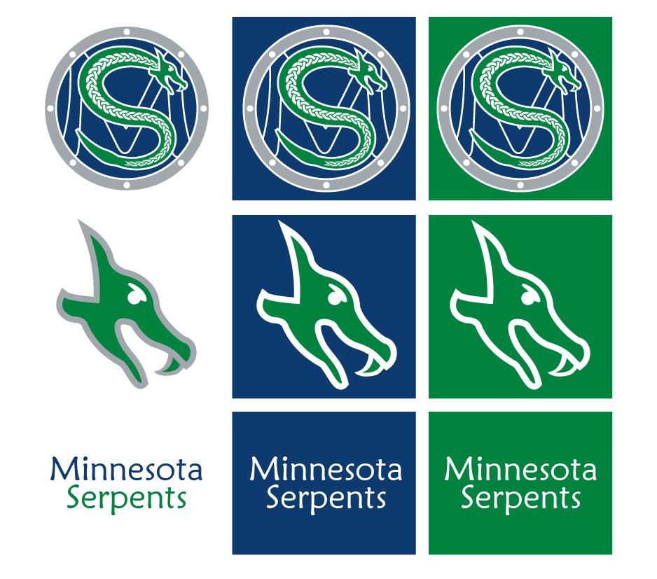
Next, Matheson revealed the team’s logos. Here the team continues the Norse theme, taking inspiration from Norse artwork. The primary logo is a Viking shield with a stylized “M” placed on it in Blue, then a depiction of Jörmungandr is painted in green and white over top, making up the shape of an “S”. The serpent also features a classic Norse braid design that is featured in their artwork. The team also has an alternate logo featuring just the head of Jörmungandr. Silver is added to the scheme as the metal on the outside of the shield. 

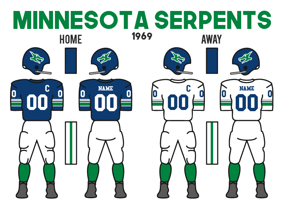
The logo was quite well received, however, the jerseys left a lot to be desired. The home uniform would be blue with a unique set of stripes. With 4 white stripes encompassing a stripe of each of the team’s colours. However, the Green stripe is the thickest of the stripes. Matheson pointed out that he wanted the striping to be completely different than any other team before. He accomplished it, however with criticism, especially about the fact that silver is only used in that one single stripe on the uniform. The pants would be white with a green stripe, and the socks simply all green. The road is pretty much the same as the home with just the blue base and white numbers colour swapped. The helmet was probably the best element, as the secondary Jörmungandr logo is used. 
Regardless of what others thought, Matheson was still very happy to have his team be brought to life.

On top of the branding reveal, Matheson also revealed the name of the team’s new stadium. While the original name idea had been simply Minnesota Football Stadium, Matheson came through with a better name of Midgard Stadium. Once again, he kept going with the Norse theme, as Midgard is the name of Earth within Norse Mythology. It also connects to serpents with Jörmungandr being the Midgard Serpent who is wrapped around the planet. Midgard Stadium will be about average size for NAAF stadiums, housing 50,230 seats. 

LONG ISLAND RAIDERS CELEBRATE 50 YEARS
The original Long Island Raiders were founded in 1919, as members of the NYCFL. 50 years later, that original team did not exist anymore. After the 1951 NYFL season (the league was renamed in the 1940s), the Raiders were folded as a part of the NYFL’s merger with the ACFL. In 1954, Long Island saw the return of football in the form of the relocated Hartford Hawks. After one season as the Long Island Hawks, the Raiders would return with Owner Wayne Tillman changing the name after just one season. Since then, the team has become a successful team in the NAAF with 2 McCallister Cup titles. 

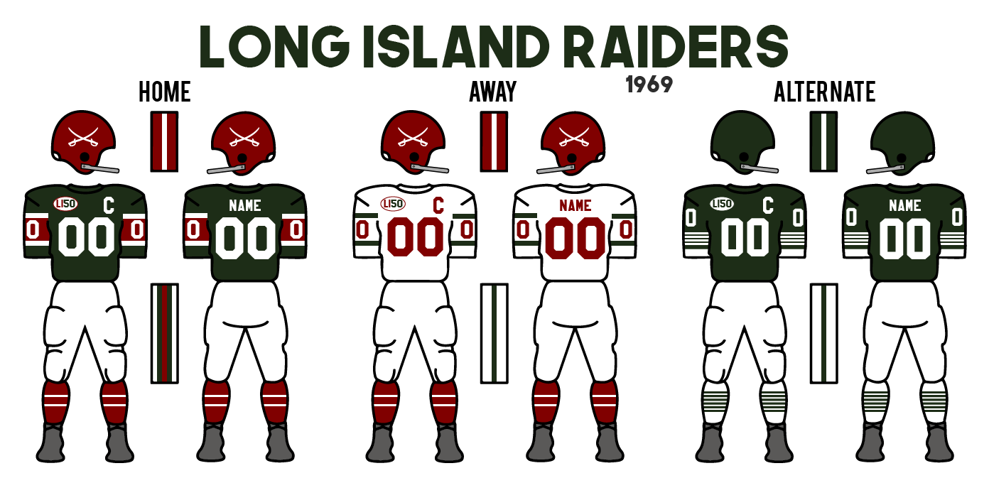
This season, to mark the 50-year anniversary of the team’s founding, the Raiders made some changes to their uniforms. The first is simply the addition of a “LI50” patch on the front of their jerseys, following in the footsteps of several other teams that have celebrated their history. 

However, the Raiders took it a step further and became just the second team to add a 3rd/Alternate jersey to their mix. While Tillman was a little worried that he may not be able to add the design after Toronto dropped their Hamilton Steelers alts last season, there were no issues from the league and they moved forward with the alternate option. This uniform is a throwback to the Raiders’ look from the 1951 season. The jersey is the team’s usual shade of dark green, which had only become the team’s colour after an attempt at black had ended up discoloured back when they first began to play in 1919. The uniform as a whole is as close as they could get to recreating the 50s jerseys while still following the jersey guidelines in the NAAF. Also to note, Maroon is completely removed as that was only added to the colour scheme following the team’s rebrand from the Long Island Hawks in 1955. 

With the addition of a 3rd jersey, which featured a new helmet, jersey, pants, and socks, the team decided to get rid of their secondary green pants and white socks from the white jersey and replace them with the maroon socks from the home jersey and the white pants from the alternate. 

Tuesday, 17 August 2021

Introducing the Pittsburgh Blacksmiths

Introducing the Pittsburgh Blacksmiths

Following the league meetings, William Braddock would finally reveal the brand for his new team: The Pittsburgh Blacksmiths. 

The name was selected for two main reasons: to appeal to the established Hammers fan base with a steelwork related name that shows that the team is still the team for the fans, as well as appealing to the steelwork industry of which the team's main financial partner of Marshall Steelworks resides. There is also a sense from some fans and people in the NAAF, that the name takes a shot at the Hammers, being that a blacksmith uses a hammer to forge weapons. It’s almost like the team is using the Hammers to forge a new path in the NAAF.

As for the look of the team, they would look to maintain the classic black design that the Hammers typically use, but refreshing it with a fiery orange colour to represent burning metal. 

The logo is an anvil, the classic workstation for a blacksmith with a “P” symbol within a square that is heat pressed/branded into the side of the anvil. The alternate logo is simply the “P” symbol on its own, which will appear on the helmet, and then the wordmark which is to be in the same style as the heat-pressed symbol. 

The uniforms certainly took on a unique design with a classic style black helmet with orange stripes and the “P” logo on the side. Then a black jersey with stencil number font, however, the unique design is the heat-pressed square that surrounds the numbers acting as the only striping on the jersey. White pants with an orange and black stripe and then black socks with orange stripes round out the jersey. The road simply makes the jersey white with the inside of the number patches being black instead of also being white.


Would love to hear everyone’s thoughts! 

Monday, 24 August 2020

Introducing the Louisville Thunder

Introducing the Louisville Thunder


Not long after Kirkdale introduced the Indiana Victors, Vince Forsyth revealed his own Louisville Thunder. 

While Forsyth originally was the head of a Cincinnati bid, he is originally from Charleston, Indiana just north of Louisville. He went to university in Louisville and eventually worked with Kirkdale in Indianapolis before he went to the Cincinnati team for the past couple of years. He was worried Louisville was going to be too small, but when the league was all for the move Forsyth couldn’t be more excited.  As a kid, he was able to see the Kentucky Derby once and he loved the show and the sound of the horses as they raced. Thunder. That was the sound that he connected to the horses. He had a horse on a family farm that he had named “Lucky Thunder”. He did have dreams of one-day racing in the derby but they were short-lived, but he loved his horse. Lucky would become the inspiration for the name of the Louisville football team. The logo and team mascot would become Lucky Thunder himself. The horse’s head outlined in gold is the main logo with lightning bolts becoming other elements on the wordmark. Gold was the original colour to symbolize the thunderstorm and lightning that the name comes from, while the deep red symbolizes the roses of the Derby.  

The jerseys are red with lightning bolt striping on the shoulders, pants and helmet. The team has both gold and white pants which they will likely mix and match throughout the season. The helmet will feature the silhouette of Lucky Thunder and the bolt on top. 
The name for the team was not suggested by anyone, I certainly had a tougher time coming up with a name I loved for Louisville. Colonels was the most suggested, but I never loved it and felt it was too obvious and has been used before. There were some great civil war-related names that I considered, but with Indy, I wanted to go a different direction. Thunder came from that and I fell for it instantly. Love the red-gold colour scheme, and wanted to do something like that, DireBear had suggested the colours scheme for Indy, but I liked it more for this team. Again thanks for the help Darknes and Scratch on the designing process! 

1958-Present


Sunday, 23 August 2020

Introducing the Indiana Victors

 Introducing the Indiana Victors

The first of the two new expansion teams to release their logo and uniforms was Indianapolis. Owner Sammy Kirkdale held a press conference to showcase them. 

Kirkdale’s family has been heavily involved in the military. His father fought in WW1 and his younger brother was in WW2 more recently. Unfortunately, his brother did not return from WW2. Sammy has honoured his brother as well as his father and extended family with efforts in the city of Indianapolis to help veterans as well as always carry on their legacy. The Soldiers & Sailors Monument in the city’s centre has always been a symbol to him and the state. The inscription at the monument reads “To Indiana’s Silent Victors”. The inscription became the inspiration for Kirkdale’s new team. Victors would be the name, but Indiana had to be the location. The monument represents the state, the Victors will too.  

From there the design process began. After several months the team came to a shield logo with “Victors” on a diagonal sash, with the silhouette of the Monument’s Victory Statue. Three orange stripes fill out the left side of the logo. The colours were picked mainly for the purpose of being unique among the 8 established teams. Green and orange do this well especially the shades of which the Green is more vibrant than that of Boston and the Orange has a hint more red than the Tigers’. 

The uniforms feature 3 stripes on the sleeves, with 2 thinner stripes outlining each of them. The pants continue the 3 stripe pattern without the thinner stripes, while the socks and helmet have the same style of stripe as the sleeve. They are the first team to include numbers on their helmets.  

Shoutout to QCS for suggesting the Indiana Victors, and I loved the name from the moment I saw it! Also, thanks to Darknes and Scratch with help in the designing process. 

There were a few solid names, but I really wanted to go outside the box with these teams and this was a perfect idea. Very unique, though a little tougher to come up with a cool identity, but a challenge I enjoyed.

1958-Present

Thursday, 19 March 2020

Worcester Athletics

Worcester Athletics:
The league officially introduced Athletics owner Richard Paul and the Worcester Athletics as a member club of the NAAF. The Worcester Athletic Club has been around since the late 1800s and has competed in football since the early 1900s. They were a founding member of the NEFC and have been able to win 6 McCallister Cups and were the last team to actually beat Boston in the title game in 1927. The team had spent the past few seasons in a regional amateur league as they never returned to the NEFC after WW2. With this opportunity, Paul wants to bring the team back into professional football. Now the team will play the first season out of the Worcester Athletic Club Grandstands which hosts 20,230 people but has a new stadium under construction closer to downtown. 

Richard Paul was debating rebranding the club (much like the Independents from Boston Football Club), but he decided to keep the Athletics name. They still updated the look of the team. The new logo is an updated crest that they used to wear (Worcester has some soccer like feel). The W.A.C. (Worcester Athletic Club) is on the top of the crest and in the wordmark. W-A is the centerpiece of the brand and has been for a while. The newest part of the logo is the red heart which is a symbol for the city of Worcester. The heart is on the city flag and comes from the nickname ``The Heart of the Commonwealth``. The colours of cream and black are classic colours for the Athletics. They also will be the second team to wear light jerseys at home (Boston being the other). The stripes on the sleeves have changed to be angled now coming to a point on the sides, which is an attempt at a modern look. The team`s crest used to be on the left side of their chest but is now been updated to just the W-A logo. 

1951-1952

1953-1955

1956-1957

1958-Present

Hearn is out as lead Ownership Candidate in Kansas City

In the past month, Cal Hearn had become the frontrunner for ownership of the Kansas City NAAF franchise. In the past week being made more of...