Most of the press conference centred around questions about the new deal with the WFU, and Jameson would give the important details as laid out in the previous post. Once, those questions were asked and Jameson wrapped up his part of the conversation, he turned the floor back over to Oscar Patterson who would talk about the new jerseys.
As Patterson took the spotlight he would have a blank uniform set with him. He would go over the details of the improvements the team at Patterson Athletics was making to the uniforms for this season. He showed off the new, lighter materials that the set had. He noted the shorter sleeves on the jersey and the more fitted style to work with pads under the jersey. He also was happy to show off the Patterson Athletics logo just under the collar on the back of the jersey.

When it came to the actual designs, Patterson would note that there were some limitations the team had to make for cost reasons as well as limitations on the time the team had to design 13 brands, plus now 5 more to come. The biggest is that teams would only be allowed one pair of pants in their set, which would be worn with both the home and away jerseys. Also, alternate uniforms would also not be included in the first season of the partnership.
Ryan Jameson would have a final word stating that part of this new partnership is a mandate that each team have a logo that would be much more applicable to print. Specifically, teams with “hand drawn” logos or logos with awkward sizes would need to get an update to something more 2D and simple. Jameson hopes that the refreshed looks will help with the league’s branding and make league-branded prints easier to produce.
At the end of the conference, Patterson was excited to reveal the new looks for 3 teams going into next season. Of course, he prefaced the reveal with the fact that these teams are the ones that had the least changes to their brand. While it wasn’t super exciting he felt those teams would be the best to show off the new jersey template on the players.
As each team was revealed a couple of the team’s players would model the jerseys.
Indiana Victors
The Victors updated their look ahead of the 1967 season, and it has been a hit with the fans. So, the team wanted to keep the fresh design as they transitioned to the new template.
Logos: Nothing changes with the logos for this update. The shield logo remains the primary mark with the torch logo being the secondary but may be used in some print circumstances.

Uniforms: Not many changes with the uniforms. The only differences are the numbers moving to the shoulders of the road, as well as a white facemask, which only 2 teams will be using this season.

Field: The logo at midfield is over top of the centre line, but the rest of the field remains unchanged.

Montreal Rouge
The next team is the Montreal Rouge who also wanted to keep the design they have had since 1965. While the fans were initially not huge fans of the look, they have grown to love it, and owner Alvon Martineau is glad because he really loves the look.
Logos: No changes to the logos occurred.

Uniforms: The jerseys are also much the same, but a pair of white stripes have been added to the helmet.

Field: The logo at midfield is now over top of the centre line, but the rest of the field remains unchanged.

Finally, the Toronto Steelheads also kept their most recent update intact. Owner Jerry Anderson still loves the look and refused any changes to the jersey aside from larger maple leaves on the shoulder.
Logos: No changes to the logos occurred.

Uniforms: As mentioned the maple leaves on the sleeves are slightly larger this time, while the numbers are moved to the shoulders to make space for the leaf and stripes.

Field: Nothing changes with the field for this season.

1970 Brand Changes - Part 2
The next set of teams to be revealed were teams that were forced to make changes to their logos but didn’t make a lot of changes to the uniform.
Boston Independents
Boston was not necessarily forced to make a change, but the team felt that a better-looking logo might be a good upgrade while not straying too far from the tradition of the brand.
Logos: The Independents get rid of their abnormally long interlocking “B-I” logo, and get a new, much more balanced version of the logo to replace it. They also have gotten a new font for their wordmark.

Uniforms: The uniforms don’t see a big change. The pants have a darker shade of tan/gold which better matches the sleeve stripes. The TV numbers are also moved to the shoulders for both logos.

Field: The only change to the field at Richardson Stadium is the midfield logo, which is now an all-white version of their updated logo.

Buffalo Blue Wings
The defending champs were practically called out by Jameson over the new logo mandate with their winged buffalo logo, but frankly, owner Milton Charles, also felt it was time to get a better logo for branding. Oscar Patterson would take the lead on the design for the logo of his former team and certainly didn’t disappoint.
Logos: The new logo is still a winged buffalo, but just the silhouette with the horn being the defining detail outside of the silhouette. The alternate logo is also new with a winged B that is expected to be used in other parts of the brand.

Uniforms: The big change to the uniforms is the wing on the helmet which Patterson, who had inspired the original, got a chance to make perfect, at least in his eyes. The wing is much stronger now and matches the wing on the primary logo. The team also joins Indiana as the only 2 teams to experiment with a white facemask.

Field: The field at Milton Charles Stadium remains the same except for a new helmet logo at midfield to reflect the new helmet design.

London Tigers
The Tigers have gotten by recently with their “L-T” logo, but they really needed to move on from the tiger head, and they would go with a new direction while keeping the brand the same.
Logos: The new logo is a tiger paw with the “L-T” logo still on the palm. The “L-T” logo remains secondary though the stroke is now removed.

Uniforms: The uniforms remain the same general design. The Helmet now features the new paw logo. The team also adjusted the orange in the design to be more red than before making for a more vibrant orange colour. Field: Western Fair Stadium doesn’t see any changes to the field.

Louisville Thunder
Lucky Thunder needed a bit of a facelift and would get it with the Thunder’s new look.
Logos: Lucky Thunder gets a much more simple look with the angular horse head, featuring a lightning bolt trailing from his eye. The alternate is now a curved bold, while the team is using a new font for their word mark.

Uniforms: The new lightning bolt is on the shoulders, while the bolt on the road is now red instead of gold with a red outline.
Field: Thunder Stadium has swapped out the NAAF logo in favour of their new primary logo, while the endzones have been simplified to read “Thunder”.
The next set of teams to be revealed were teams that were forced to make changes to their logos but didn’t make a lot of changes to the uniform.
Boston Independents
Boston was not necessarily forced to make a change, but the team felt that a better-looking logo might be a good upgrade while not straying too far from the tradition of the brand.
Logos: The Independents get rid of their abnormally long interlocking “B-I” logo, and get a new, much more balanced version of the logo to replace it. They also have gotten a new font for their wordmark.

Uniforms: The uniforms don’t see a big change. The pants have a darker shade of tan/gold which better matches the sleeve stripes. The TV numbers are also moved to the shoulders for both logos.

Field: The only change to the field at Richardson Stadium is the midfield logo, which is now an all-white version of their updated logo.

Buffalo Blue Wings
The defending champs were practically called out by Jameson over the new logo mandate with their winged buffalo logo, but frankly, owner Milton Charles, also felt it was time to get a better logo for branding. Oscar Patterson would take the lead on the design for the logo of his former team and certainly didn’t disappoint.
Logos: The new logo is still a winged buffalo, but just the silhouette with the horn being the defining detail outside of the silhouette. The alternate logo is also new with a winged B that is expected to be used in other parts of the brand.

Uniforms: The big change to the uniforms is the wing on the helmet which Patterson, who had inspired the original, got a chance to make perfect, at least in his eyes. The wing is much stronger now and matches the wing on the primary logo. The team also joins Indiana as the only 2 teams to experiment with a white facemask.

Field: The field at Milton Charles Stadium remains the same except for a new helmet logo at midfield to reflect the new helmet design.

The Tigers have gotten by recently with their “L-T” logo, but they really needed to move on from the tiger head, and they would go with a new direction while keeping the brand the same.
Logos: The new logo is a tiger paw with the “L-T” logo still on the palm. The “L-T” logo remains secondary though the stroke is now removed.

Uniforms: The uniforms remain the same general design. The Helmet now features the new paw logo. The team also adjusted the orange in the design to be more red than before making for a more vibrant orange colour.


Louisville Thunder
Lucky Thunder needed a bit of a facelift and would get it with the Thunder’s new look.
Logos: Lucky Thunder gets a much more simple look with the angular horse head, featuring a lightning bolt trailing from his eye. The alternate is now a curved bold, while the team is using a new font for their word mark.

Uniforms: The new lightning bolt is on the shoulders, while the bolt on the road is now red instead of gold with a red outline.

Field: Thunder Stadium has swapped out the NAAF logo in favour of their new primary logo, while the endzones have been simplified to read “Thunder”.

1970 Brand Changes Part 3
Today, we start to get to some teams making more changes all around. These three teams get some minor to major changes to their logo, as well as some changes to their uniforms.
Minnesota Serpents
The Serpents have only been around for a single season, but they are making changes to their uniforms already. Owner Kris Matheson and Oscar Patterson agreed that the initial design of the team wasn’t quite right and they would make some changes to the uniforms.
Logos: The logos weren’t touched much aside from the tooth on the serpent was changed to silver for most applications.

Uniforms: The biggest change for the uniforms is the swap to silver pants from white. The striping throughout the uniform is also more consistent. The overall motive with the new design was to bring silver in a lot more than on the previous design after it was left to a single stripe on the jersey sleeve on the previous set.


Ottawa Royals
The Royals have lots of history with their design, but after the Patterson team got the opportunity to refresh the Royals’ black letter font, Royals’ owner Laura McNeil, absolutely loved it and allowed for some more changes.
Logos: The new logo features the new black letter font with a refreshed crown that now just sits above the “R” instead of on top of it. The primary mark also features a banner around the logo as a call to royal imagery.

Uniforms: The updated crown is applied to the helmet as the old crown has always been. The home uniform doesn’t change much, but the road does see some changes due to the limitation of one pair of pants. The look needed to have more purple and so the striping pattern features more purple than the previous look. The final change sees the Royals use the black letter as the captain’s patch.

Field: Royals Stadium will now feature the banner logo at midfield which helps to replace the purple box that had been placed at midfield for the last couple of seasons. The endzones simply see the new wordmark replace the old.

Pittsburgh Blacksmiths
The Blacksmiths went through a lot of different design options which included some more dramatic changes, that featured a lot more orange, but ultimately a more safe choice would be made in the end. The more charcoal-focused design better captured the brand of the blacksmiths.
Logos: The big change is the swapping of the primary and secondary marks. The primary is now just the “branded P” logo, while the secondary logo includes the anvil. The logo is also simplified with the black border applied to the previous design removed.

Uniforms: The uniform gets a much-needed update, with the very unique square is removed from the TV numbers, but it stays in the design to surround the captain’s patch. The new sleeve design now just features a single orange stripe below the stencil numbers.

Field: With the Hammers still holding onto dear life over the stadium rights, the field doesn’t change for Pittsburgh going into next season.

1970 Brand Changes Part 4
To round out the current NAAF redesigns, the final 3 teams made the biggest changes to their uniforms and logos.
Halifax Mariners
Ever since the Mariners arrived in Atlantic Canada, the team has certainly carried the remnants of the Worcester Athletics through their branding. While the team initially wanted to honour the old club by keeping the famous cream in the brand along with the new blue, Owner Elliot Hudson has never quite felt right about the look. His uncertainty was a big reason the team had already changed their look ahead of the 1966 season. Finally, with the opportunity to work with Patterson Athletics, he could have a brand that felt like its own brand for the city of Halifax.
Logos: The first big change is that the team is dropping the cream from the colour scheme, and in its place, promoting the orange introduced on their 1966 logo to their secondary colour. The logo reflects this change with all the cream changed to white and the blue ring around the logo changed to orange. The team also introduces a new anchor mark for their secondary logo.

Uniforms: The uniforms see a significant overhaul. The home jerseys stay blue, with 2 orange stripes surrounding a single white stripe on the sleeve cuffs. The anchor is also on the sleeve with the numbers moving to the shoulders. The team also introduces an orange stroke around the white numbers. The roads take a similar design but with several colours swapped. While there was some discussion about the team moving on from the “heart” patch on the jerseys honouring the original owner, Richard Paul, ultimately Elliot Hudson wanted to keep it. However, the patch is now coloured to match the colour scheme and the font is changed to match the Mariners’ brand. Field: While there were sweeping changes to the brand, the field at Atlantic Stadium does not change.

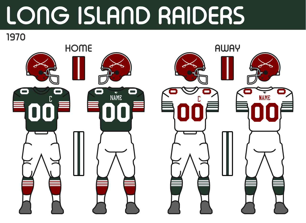
Long Island Raiders
The Raiders have had the same look since they rebranded to the Raiders in 1955. Last season, the team introduced a throwback to the team’s original green and white look. Owner, Wayne Tillman was very fond of that design and he wanted to go back to it, but also felt that the current brand had been so iconic with the team’s recent success. In the end, the team at Patterson Athletics came up with a meld of both.
Logos: The team’s new logo, brings back the classic crossed swords. The outline of Long Island is replaced with an oval behind the swords with “LI” and “Raiders” inscribed on it. The years 1919 and 1922 are also on the logo which are the years the original Raiders were founded and the current franchise, the original Hartford Maroons/Hawks, was founded respectfully. The other change sees the team adjust the green of their brand to stand out as more green than black.

Uniforms: The new uniforms mix the old with the new. The helmet remains the same, with the new swords on the side. The new jersey features the old design’s 4 stripes but with the maroon coming through underneath. The design was one of the more challenging designs to get right technically, but Tillman was willing to help make it happen, even if it required a little more money. The road has a similar design, but most details remain green with the numbers and names in maroon.

Field: The new field sees the swords placed at midfield, replacing their anniversary logo from last season. While the endzones get “Raiders” with the new font.

Providence Gold Stars
Finally, the Providence Gold Stars round out the bunch. As the team takes the opportunity to evolve their design in hopes of some new luck.
Logos: The logo remains pretty similar to their previous one, but the new anchor is now just a single colour. The shape of the anchor is based on the anchor on the Rhode Island flag. The team also is making a change with their font, going to a block font that is often seen on ships.

Uniforms: The new uniforms are a bit tamer compared to what the Gold Stars are used to, but it’s a fresh look. The new home uniform features the new font on the numbers and captain patch. The two stripe pattern they had started with the previous set returns but is now applied to the sleeves. The biggest change comes with the removal of the yoke that the team has had for many years. In its place are a pair of gold stars on the shoulders. The helmet maintains the 3 stars on the front to signify the pre-NAAF 3 McCallister Cups the team has won, however, the stripes on the helmet not longer go around the stars, but instead, stop just before the top star.
Field: The Gold Stars carry over a similar design for their field at New Providence Stadium, but have just updated the font and logos to match their new set.
To round out the current NAAF redesigns, the final 3 teams made the biggest changes to their uniforms and logos.
Halifax Mariners
Ever since the Mariners arrived in Atlantic Canada, the team has certainly carried the remnants of the Worcester Athletics through their branding. While the team initially wanted to honour the old club by keeping the famous cream in the brand along with the new blue, Owner Elliot Hudson has never quite felt right about the look. His uncertainty was a big reason the team had already changed their look ahead of the 1966 season. Finally, with the opportunity to work with Patterson Athletics, he could have a brand that felt like its own brand for the city of Halifax.
Logos: The first big change is that the team is dropping the cream from the colour scheme, and in its place, promoting the orange introduced on their 1966 logo to their secondary colour. The logo reflects this change with all the cream changed to white and the blue ring around the logo changed to orange. The team also introduces a new anchor mark for their secondary logo.

Uniforms: The uniforms see a significant overhaul. The home jerseys stay blue, with 2 orange stripes surrounding a single white stripe on the sleeve cuffs. The anchor is also on the sleeve with the numbers moving to the shoulders. The team also introduces an orange stroke around the white numbers. The roads take a similar design but with several colours swapped. While there was some discussion about the team moving on from the “heart” patch on the jerseys honouring the original owner, Richard Paul, ultimately Elliot Hudson wanted to keep it. However, the patch is now coloured to match the colour scheme and the font is changed to match the Mariners’ brand.


Long Island Raiders
The Raiders have had the same look since they rebranded to the Raiders in 1955. Last season, the team introduced a throwback to the team’s original green and white look. Owner, Wayne Tillman was very fond of that design and he wanted to go back to it, but also felt that the current brand had been so iconic with the team’s recent success. In the end, the team at Patterson Athletics came up with a meld of both.
Logos: The team’s new logo, brings back the classic crossed swords. The outline of Long Island is replaced with an oval behind the swords with “LI” and “Raiders” inscribed on it. The years 1919 and 1922 are also on the logo which are the years the original Raiders were founded and the current franchise, the original Hartford Maroons/Hawks, was founded respectfully. The other change sees the team adjust the green of their brand to stand out as more green than black.

Uniforms: The new uniforms mix the old with the new. The helmet remains the same, with the new swords on the side. The new jersey features the old design’s 4 stripes but with the maroon coming through underneath. The design was one of the more challenging designs to get right technically, but Tillman was willing to help make it happen, even if it required a little more money. The road has a similar design, but most details remain green with the numbers and names in maroon.
Field: The new field sees the swords placed at midfield, replacing their anniversary logo from last season. While the endzones get “Raiders” with the new font.

Providence Gold Stars
Finally, the Providence Gold Stars round out the bunch. As the team takes the opportunity to evolve their design in hopes of some new luck.
Logos: The logo remains pretty similar to their previous one, but the new anchor is now just a single colour. The shape of the anchor is based on the anchor on the Rhode Island flag. The team also is making a change with their font, going to a block font that is often seen on ships.

Uniforms: The new uniforms are a bit tamer compared to what the Gold Stars are used to, but it’s a fresh look. The new home uniform features the new font on the numbers and captain patch. The two stripe pattern they had started with the previous set returns but is now applied to the sleeves. The biggest change comes with the removal of the yoke that the team has had for many years. In its place are a pair of gold stars on the shoulders. The helmet maintains the 3 stars on the front to signify the pre-NAAF 3 McCallister Cups the team has won, however, the stripes on the helmet not longer go around the stars, but instead, stop just before the top star.

Field: The Gold Stars carry over a similar design for their field at New Providence Stadium, but have just updated the font and logos to match their new set.


No comments:
Post a Comment