Saturday, 11 February 2023

Calgary Tigers


The Calgary Football Club was founded in 1920. The club joined the WFU as a founding member. The team’s founding owner was Bill Barker, who was very close to Edmonton owner and WFU founder Greg Mackenzie. Bill led a very strong team during the first decade of the WFU, making 6 Mackenzie Cups and winning 2 of them. In the mid-30s Bill would become ill and handed over the team to his son, Hank Barker. Hank would breathe new life into the team and they would return to the Mackenzie Cup to win back-to-back titles in 1938 and 1939. Following WW2, the Tigers would not quite be at the level they were going into the war, but they would capture a 5th title in 1949. Under Hank’s leadership, the team would continue to be a consistent contender, winning 3 more cups in 1952, 1957, and 1959. The Tigers would go through a couple of tough seasons in the early 60s but made it back to the big game in 1965. The team would continue to be competitive through the 60s, but in 1967, Hank would, unfortunately, pass away, leaving the team to his son Albert Barker. Albert had zero desire to own a football team, so he sold the team, thus ending the Barker family’s ownership of the Tigers. 

Tyler McNeil would purchase the team from the Barker family ahead of the 1968 season. McNeil was certainly a different style of owner than the Barkers before him. The Barkers were very traditional football team owners, that cared for the history of the team and the success on the field. McNeil on the other hand was much different. Sure, he obviously respected the history, but he certainly seemed to have a much more open mind when it came to changes being made to the organization, which to some could be a good thing, to others, not so much. McNeil has not made too many dramatic changes, but that could change in the near future. Either way, the WFU owners, especially Mark Livingston of the Vancouver Wolves, appreciate the perspective that McNeil has when it comes to ownership, as the WFU has needed to start thinking about the future a little more. 

The Team
The 1960s saw the Tigers team fall from their usually competitive position. They still made a couple of Mackenzie Cup appearances, mostly due to their coach Arnold Irvine. Irvine is easily the best coach the team has ever had. He was great friends with Hank Barker, and so when Barker passed away, Irvine decided he would retire at the end of the 1968 season. Irvine led the team back to the Mackenzie Cup in his final year, and then parted ways with the organization. 

McNeil was thrilled with the opportunity to bring in a coach of his choosing. He would certainly make a wild decision, hiring Alberta Provincial University Coach, Travis Hobson. Hobson had been getting some attention for his unorthodox, wild west offence. The offence was quite wild with lots of options, reverses, passes onto passes, and just about everything you can think of. On top of that, it’s a very fast-tempo offence with lots of no-huddle play calls. Hobson’s first season in 1969 as head coach was not great, but they are hoping as Hobson has the chance to get the offence installed they will improve. 

Last season, the offence revolved around a pair of running backs. RB John Drexel brought the speed to make big plays happen, while the veteran RB Tyler Smith was more of a power back. The Tigers like to run a lot of looks with both players on the field. The team does have a bit of a QB controversy on their hands. QB Jerome Sheppard was a steady QB with decent arm strength, that helped the team get to the Mackenzie Cup in 1968, but he struggled in the new offence which allowed the younger QB Jesse Essex to get into the game. Essex’s run-first style does give the wild west offence another option on the ground and seemed to work better in Hobson’s system. The team also had a couple of solid WRs in Ted Jackson and Spencer Hicks. While the offence does get more of the attention, the Tigers are packing some punch on defence with one of the best DLs in the WFU in Damian Battles, who is paired up with the Barrett twins in Chris and Roger. Junior Abbott is the anchor at LB and DB Scott Summerhayes has done well to create a lot of turnovers for the team in the secondary. The Tigers may still not be the best team out of the WFU, but they are certainly one of the most intriguing. 

The Brand
Most of the WFU teams would not be getting a massive change to their looks with the designs coming on short notice. However, Tyler McNeil certainly had some changes he wanted to make. 

Logos: The team does continue to use the same “C” logo that they have had for a long time, but the colours are the most noticeable difference. For a while, the Tigers were an orange and black team, but in the last decade they had added red to the look, but now black was now gone from the brand. 

Uniforms: The new jerseys are a completely new design. The home remains orange primarily, but now 7 stripes (4 red, 3 orange) are on each sleeve which are on white bases. The number font was changed for the jerseys after Tyler McNeil got to see the Boston Independents’ numbers and asked for those specifically. The road is not too different, although the colour of the stripes on the sleeves is opposite the home jersey. 

Stadium and Field: The Tigers play out of Tigers Stadium at the Stampede, which is located on the Calgary Stampede grounds near downtown. The Stadium is the newest facility in the WFU, being opened in 1963, and seats 32,400 regularly. There are some plans to expand the stadium if the NAAF deal works out and the team gains more success. As for the field design, the new orange-red marks fill the endzone with “Calgary” and the “C” is at midfield. The field numbers also get the treatment of the team’s font. 

Friday, 10 February 2023

A Brief History of the WFU


The Western Football Union came together in 1924. Greg Mackenzie, owner of the Edmonton Football Club was a big reason the league came together to form a bigger competition from locally competing provincial leagues. Both the British Columbia Football Division and the Alberta Football Championship, allowed their strongest teams to enter the new competition, thus forming the original 4 teams of the Calgary Football Club, the Edmonton Football Club, the Vancouver Football Club, and the Victoria Victorias. Greg Mackenzie would provide the league with a cup which was built by a family member. The cup would be deemed the Mackenzie Cup and the 4 teams would compete to decide who was the champions of the West. 

In 1927 the league would add 3 more teams from the Saskatchewan and Manitoban divisions. The Regina Football Club, Saskatoon Athletic Club, and the Winnipeg Football Club would be added. 

When the Great Depression hit in the 1930s the WFU would face some hardship and Saskatoon would pull from the league in 1934. Regina and Victoria would soon follow in 1937. The league would eventually, suspend operations at the start of WW2. 

In 1946, the WFU got back up and running with the same 4 teams from Calgary, Edmonton, Vancouver, and Winnipeg. In 1948, Regina would be reinstated and the league would remain at 5 teams for the next 2 decades. Then in 1970, the league would partner with the NAAF to form a merger. 

Mackenzie Cup Winners
1924: Edmonton Football Club
1925: Edmonton Football Club
1926: Victoria Victorias
1927: Edmonton Football Club
1928: Calgary Football Club
1929: Winnipeg Football Club
1930: Vancouver Football Club
1931: Calgary Tigers
1932: Edmonton Football Club
1933: Edmonton Rangers
1934: Edmonton Rangers
1935: Vancouver Football Club
1936: Winnipeg Falcons
1937: Winnipeg Falcons
1938: Calgary Tigers
1939: Calgary Tigers
1940-1945: Not rewarded due to WW2
1946: Vancouver Wolves
1947: Edmonton Rangers
1948: Edmonton Rangers
1949: Calgary Tigers
1950: Edmonton Rangers
1951: Regina Threshers
1952: Calgary Tigers
1953: Vancouver Wolves
1954: Winnipeg Falcons
1955: Edmonton Rangers
1956: Edmonton Rangers
1957: Calgary Tigers
1958: Vancouver Wolves
1959: Calgary Tigers
1960: Winnipeg Falcons
1961: Vancouver Wolves
1962: Edmonton Rangers
1963: Edmonton Rangers
1964: Vancouver Wolves
1965: Edmonton Rangers
1966: Edmonton Rangers
1967: Vancouver Wolves
1968: Vancouver Wolves
1969: Vancouver Wolves

Totals
Edmonton Rangers - 15
Vancouver Wolves - 10
Calgary Tigers - 8
Winnipeg Falcons - 5
Regina Wheat Kings - 1
Victoria Victorias - 1

Friday, 3 February 2023

1970 Brand Changes - 1970 Post-Meetings Press Conference - Patterson Athletics Jersey Reveal


Most of the press conference centred around questions about the new deal with the WFU, and Jameson would give the important details as laid out in the previous post. Once, those questions were asked and Jameson wrapped up his part of the conversation, he turned the floor back over to Oscar Patterson who would talk about the new jerseys. 

As Patterson took the spotlight he would have a blank uniform set with him. He would go over the details of the improvements the team at Patterson Athletics was making to the uniforms for this season. He showed off the new, lighter materials that the set had. He noted the shorter sleeves on the jersey and the more fitted style to work with pads under the jersey. He also was happy to show off the Patterson Athletics logo just under the collar on the back of the jersey.

When it came to the actual designs, Patterson would note that there were some limitations the team had to make for cost reasons as well as limitations on the time the team had to design 13 brands, plus now 5 more to come. The biggest is that teams would only be allowed one pair of pants in their set, which would be worn with both the home and away jerseys. Also, alternate uniforms would also not be included in the first season of the partnership. 

Ryan Jameson would have a final word stating that part of this new partnership is a mandate that each team have a logo that would be much more applicable to print. Specifically, teams with “hand drawn” logos or logos with awkward sizes would need to get an update to something more 2D and simple. Jameson hopes that the refreshed looks will help with the league’s branding and make league-branded prints easier to produce.

At the end of the conference, Patterson was excited to reveal the new looks for 3 teams going into next season. Of course, he prefaced the reveal with the fact that these teams are the ones that had the least changes to their brand. While it wasn’t super exciting he felt those teams would be the best to show off the new jersey template on the players.

As each team was revealed a couple of the team’s players would model the jerseys.

Indiana Victors

The Victors updated their look ahead of the 1967 season, and it has been a hit with the fans. So, the team wanted to keep the fresh design as they transitioned to the new template.

Logos: Nothing changes with the logos for this update. The shield logo remains the primary mark with the torch logo being the secondary but may be used in some print circumstances. 

Uniforms: Not many changes with the uniforms. The only differences are the numbers moving to the shoulders of the road, as well as a white facemask, which only 2 teams will be using this season.

Field: The logo at midfield is over top of the centre line, but the rest of the field remains unchanged.


Montreal Rouge

The next team is the Montreal Rouge who also wanted to keep the design they have had since 1965. While the fans were initially not huge fans of the look, they have grown to love it, and owner Alvon Martineau is glad because he really loves the look.

Logos: No changes to the logos occurred.

Uniforms: The jerseys are also much the same, but a pair of white stripes have been added to the helmet.

Field: The logo at midfield is now over top of the centre line, but the rest of the field remains unchanged.

Toronto Steelheads

Finally, the Toronto Steelheads also kept their most recent update intact. Owner Jerry Anderson still loves the look and refused any changes to the jersey aside from larger maple leaves on the shoulder. 

Logos: No changes to the logos occurred.

Uniforms: As mentioned the maple leaves on the sleeves are slightly larger this time, while the numbers are moved to the shoulders to make space for the leaf and stripes. 

Field: Nothing changes with the field for this season.

1970 Brand Changes - Part 2

The next set of teams to be revealed were teams that were forced to make changes to their logos but didn’t make a lot of changes to the uniform.

Boston Independents

Boston was not necessarily forced to make a change, but the team felt that a better-looking logo might be a good upgrade while not straying too far from the tradition of the brand.

Logos: The Independents get rid of their abnormally long interlocking “B-I” logo, and get a new, much more balanced version of the logo to replace it. They also have gotten a new font for their wordmark.

Uniforms: The uniforms don’t see a big change. The pants have a darker shade of tan/gold which better matches the sleeve stripes. The TV numbers are also moved to the shoulders for both logos.

Field: The only change to the field at Richardson Stadium is the midfield logo, which is now an all-white version of their updated logo.

Buffalo Blue Wings

The defending champs were practically called out by Jameson over the new logo mandate with their winged buffalo logo, but frankly, owner Milton Charles, also felt it was time to get a better logo for branding. Oscar Patterson would take the lead on the design for the logo of his former team and certainly didn’t disappoint.

Logos: The new logo is still a winged buffalo, but just the silhouette with the horn being the defining detail outside of the silhouette. The alternate logo is also new with a winged B that is expected to be used in other parts of the brand.

Uniforms: The big change to the uniforms is the wing on the helmet which Patterson, who had inspired the original, got a chance to make perfect, at least in his eyes. The wing is much stronger now and matches the wing on the primary logo. The team also joins Indiana as the only 2 teams to experiment with a white facemask.

Field: The field at Milton Charles Stadium remains the same except for a new helmet logo at midfield to reflect the new helmet design.

London Tigers

The Tigers have gotten by recently with their “L-T” logo, but they really needed to move on from the tiger head, and they would go with a new direction while keeping the brand the same.

Logos: The new logo is a tiger paw with the “L-T” logo still on the palm. The “L-T” logo remains secondary though the stroke is now removed.

Uniforms: The uniforms remain the same general design. The Helmet now features the new paw logo. The team also adjusted the orange in the design to be more red than before making for a more vibrant orange colour.
Field: Western Fair Stadium doesn’t see any changes to the field. 

Louisville Thunder

Lucky Thunder needed a bit of a facelift and would get it with the Thunder’s new look.

Logos: Lucky Thunder gets a much more simple look with the angular horse head, featuring a lightning bolt trailing from his eye. The alternate is now a curved bold, while the team is using a new font for their word mark.

Uniforms: The new lightning bolt is on the shoulders, while the bolt on the road is now red instead of gold with a red outline.

Field: Thunder Stadium has swapped out the NAAF logo in favour of their new primary logo, while the endzones have been simplified to read “Thunder”.

1970 Brand Changes Part 3

Today, we start to get to some teams making more changes all around. These three teams get some minor to major changes to their logo, as well as some changes to their uniforms.

Minnesota Serpents

The Serpents have only been around for a single season, but they are making changes to their uniforms already. Owner Kris Matheson and Oscar Patterson agreed that the initial design of the team wasn’t quite right and they would make some changes to the uniforms.

Logos: The logos weren’t touched much aside from the tooth on the serpent was changed to silver for most applications.

Uniforms: The biggest change for the uniforms is the swap to silver pants from white. The striping throughout the uniform is also more consistent. The overall motive with the new design was to bring silver in a lot more than on the previous design after it was left to a single stripe on the jersey sleeve on the previous set.

Field: With the Serpents still sharing Midgard Stadium with the University of Minneapolis, the field does not see any changes for the 1970 season.

Ottawa Royals

The Royals have lots of history with their design, but after the Patterson team got the opportunity to refresh the Royals’ black letter font, Royals’ owner Laura McNeil, absolutely loved it and allowed for some more changes.

Logos: The new logo features the new black letter font with a refreshed crown that now just sits above the “R” instead of on top of it. The primary mark also features a banner around the logo as a call to royal imagery. 

Uniforms: The updated crown is applied to the helmet as the old crown has always been. The home uniform doesn’t change much, but the road does see some changes due to the limitation of one pair of pants. The look needed to have more purple and so the striping pattern features more purple than the previous look. The final change sees the Royals use the black letter as the captain’s patch. 

Field: Royals Stadium will now feature the banner logo at midfield which helps to replace the purple box that had been placed at midfield for the last couple of seasons. The endzones simply see the new wordmark replace the old.

Pittsburgh Blacksmiths

The Blacksmiths went through a lot of different design options which included some more dramatic changes, that featured a lot more orange, but ultimately a more safe choice would be made in the end. The more charcoal-focused design better captured the brand of the blacksmiths.

Logos: The big change is the swapping of the primary and secondary marks. The primary is now just the “branded P” logo, while the secondary logo includes the anvil. The logo is also simplified with the black border applied to the previous design removed. 

Uniforms: The uniform gets a much-needed update, with the very unique square is removed from the TV numbers, but it stays in the design to surround the captain’s patch. The new sleeve design now just features a single orange stripe below the stencil numbers. 


Field: With the Hammers still holding onto dear life over the stadium rights, the field doesn’t change for Pittsburgh going into next season. 


1970 Brand Changes Part 4

To round out the current NAAF redesigns, the final 3 teams made the biggest changes to their uniforms and logos. 

Halifax Mariners

Ever since the Mariners arrived in Atlantic Canada, the team has certainly carried the remnants of the Worcester Athletics through their branding. While the team initially wanted to honour the old club by keeping the famous cream in the brand along with the new blue, Owner Elliot Hudson has never quite felt right about the look. His uncertainty was a big reason the team had already changed their look ahead of the 1966 season. Finally, with the opportunity to work with Patterson Athletics, he could have a brand that felt like its own brand for the city of Halifax.

Logos: The first big change is that the team is dropping the cream from the colour scheme, and in its place, promoting the orange introduced on their 1966 logo to their secondary colour. The logo reflects this change with all the cream changed to white and the blue ring around the logo changed to orange. The team also introduces a new anchor mark for their secondary logo.

Uniforms: The uniforms see a significant overhaul. The home jerseys stay blue, with 2 orange stripes surrounding a single white stripe on the sleeve cuffs. The anchor is also on the sleeve with the numbers moving to the shoulders. The team also introduces an orange stroke around the white numbers. The roads take a similar design but with several colours swapped. While there was some discussion about the team moving on from the “heart” patch on the jerseys honouring the original owner, Richard Paul, ultimately Elliot Hudson wanted to keep it. However, the patch is now coloured to match the colour scheme and the font is changed to match the Mariners’ brand.
Field: While there were sweeping changes to the brand, the field at Atlantic Stadium does not change.

Long Island Raiders

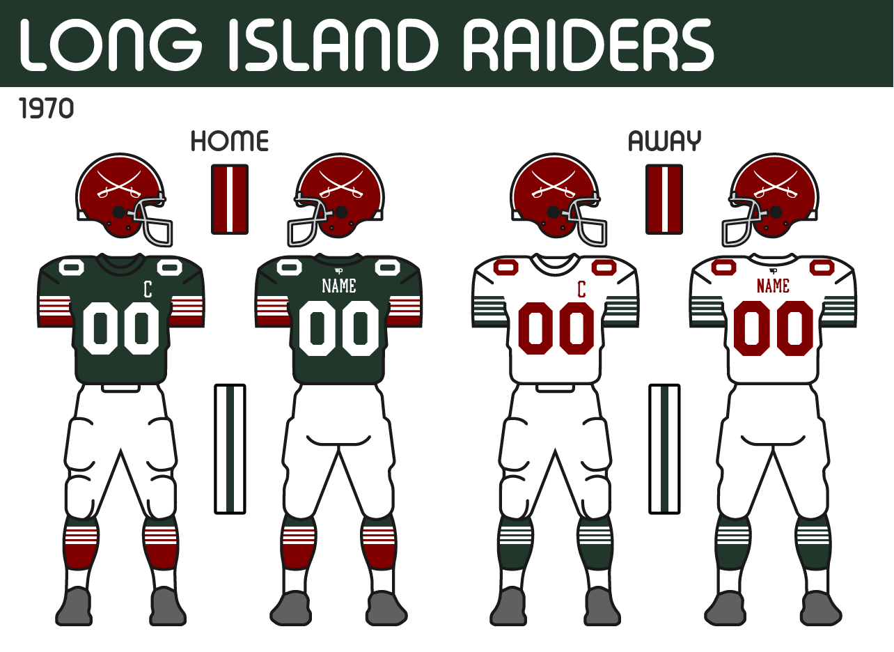
The Raiders have had the same look since they rebranded to the Raiders in 1955. Last season, the team introduced a throwback to the team’s original green and white look. Owner, Wayne Tillman was very fond of that design and he wanted to go back to it, but also felt that the current brand had been so iconic with the team’s recent success. In the end, the team at Patterson Athletics came up with a meld of both.

Logos: The team’s new logo, brings back the classic crossed swords. The outline of Long Island is replaced with an oval behind the swords with “LI” and “Raiders” inscribed on it. The years 1919 and 1922 are also on the logo which are the years the original Raiders were founded and the current franchise, the original Hartford Maroons/Hawks, was founded respectfully. The other change sees the team adjust the green of their brand to stand out as more green than black.

Uniforms: The new uniforms mix the old with the new. The helmet remains the same, with the new swords on the side. The new jersey features the old design’s 4 stripes but with the maroon coming through underneath. The design was one of the more challenging designs to get right technically, but Tillman was willing to help make it happen, even if it required a little more money. The road has a similar design, but most details remain green with the numbers and names in maroon. 

Field: The new field sees the swords placed at midfield, replacing their anniversary logo from last season. While the endzones get “Raiders” with the new font. 

Providence Gold Stars

Finally, the Providence Gold Stars round out the bunch. As the team takes the opportunity to evolve their design in hopes of some new luck. 

Logos: The logo remains pretty similar to their previous one, but the new anchor is now just a single colour. The shape of the anchor is based on the anchor on the Rhode Island flag. The team also is making a change with their font, going to a block font that is often seen on ships. 

Uniforms: The new uniforms are a bit tamer compared to what the Gold Stars are used to, but it’s a fresh look. The new home uniform features the new font on the numbers and captain patch. The two stripe pattern they had started with the previous set returns but is now applied to the sleeves. The biggest change comes with the removal of the yoke that the team has had for many years. In its place are a pair of gold stars on the shoulders. The helmet maintains the 3 stars on the front to signify the pre-NAAF 3 McCallister Cups the team has won, however, the stripes on the helmet not longer go around the stars, but instead, stop just before the top star.

Field: The Gold Stars carry over a similar design for their field at New Providence Stadium, but have just updated the font and logos to match their new set.


Thursday, 2 February 2023

1970 League Meetings: World Recap


The NAAF’s meetings would be extended after Ryan Jameson got word from Ed Morrissette that the WFU had made a decision. The 5 owners of the WFU would land in Ottawa and would state that they wanted to move forward with a partnership. The two sides would hammer out the details of the deal and officially put pen to paper. 

Everything mentioned before was still intact with the deal and is re-iterated below:

- A 2-year agreement that would make the WFU teams partial members of the NAAF for the 1970 and 1971 seasons.
- The WFU teams would compete in the NAAF, using hybrid football rules.
- The 5 teams would join the Minnesota Serpents in creating a 6-team West Division and would be able to compete for the McCallister Cup.
- Due to partial membership status, the teams will not participate in the league’s draft but will retain the ability to sign players out of college from the Western College Athletics Union without those players needing to go through the draft.
- Trades and free agency moves between the clubs would be allowed, but if the agreement comes to an end and the sides agree to part ways, any players who have NAAF memberships, which are acquired when players sign contracts with NAAF teams and enter the draft, would be able to leave their WFU teams and rejoin the NAAF if they so choose. Of course, the same is true for players coming from the WFU.
- The WFU teams would also be included in the partnership with Patterson Athletics and receive new uniforms for the 1970 season.
- The details of the deal can be renegotiated after the 1970 season, but both sides must play in the same league for the full 2 seasons unless extreme circumstances occur.

Division Alignment
Most of the details discussed in the 2nd set of meetings were about the season’s structure. In the end, the format of the season would work as follows:

The league will now be split into 3 divisions of 6:

WEST
Calgary Tigers
Edmonton Rangers
Minnesota Serpents
Regina Wheat Kings
Vancouver Wolves
Winnipeg Falcons

CENTRAL
Buffalo Blue Wings
Indiana Victors
London Tigers
Louisville Thunder
Pittsburgh Blacksmiths
Toronto Steelheads

EAST
Boston Independents
Halifax Mariners
Long Island Raiders
Montreal Rouge
Ottawa Royals
Providence Gold Stars

Schedule Formula
The season will remain at 12 games. Each team will play 8 games within their division and 4 games outside of the division. The divisional games would be split so each team plays 3 opponents 2 times (one of those 3 teams would be a designated rival), and then the remaining 2 other teams once. Then they would play 2 opponents from each of the other two divisions for a total of 4 more games. 

So for example the Buffalo Blue Wings’ opponents may look like this:
HOME
London - Division Rival
Indiana - Division Home and Home
Toronto - Division Home and Home
Louisville - Single Division Game
Vancouver - West Division Home Game
Halifax - East Division Home Game

AWAY
London - Division Rival
Indiana - Division Home and Home
Toronto - Division Home and Home
Pittsburgh - Single Division Game
Calgary - West Division Away Game
Long Island - East Division Away Game

Bye weeks will also return to their regular scheduled mid-season set but will be split across 3 weeks with 6 teams getting a bye at one time.

Playoff Expansion
The agreement also sees the NAAF playoff expanded as 8 teams will now qualify for the tournament. Each Division Winner clinches a playoff spot and will be the top 3 seeds. However, due to the WFU still desiring to have a Mackenzie Cup title game, the top 2 teams in the West Division will qualify and play each other in the first round of the playoffs. The remaining 4 teams will be a wildcard where the next 4 best teams qualify. If teams are tied, the higher-seeded team within their division will clinch the spot. For example, if the 2nd place team in the Central has the same record as the 3rd place team in the East, the Central division team would qualify. However, if the 3rd place team has a better record than the 2nd place team (much like the crossover rule), they would qualify.
An example season would look like this (seeding determined by randomization):
WEST
(1) Edmonton - Y
(7) Calgary - X
Winnipeg
Vancouver
Minnesota
Regina

CENTRAL
(2) London - Y
(4) Buffalo - X
(5) Indiana - X
Louisville
Toronto
Pittsburgh

EAST
(3) Providence - Y
(6) Long Island - X
(8) Halifax - X
Montreal
Boston
Ottawa

Quarter Finals
(1) EDM VS (7) CGY - Mackenzie Cup
(2) LDN VS (8) HFX
(3) PRO VS (6) LI
(4) BUF VS (5) IND

Teams would then be reseeded each round with the highest-seeded team remaining taking on the lowest-seeded team remaining.

1970 Draft Order
Since the WFU teams will not be included in the 1970 draft, the final order is confirmed to be:
1 - Louisville
2 - Providence
3 - Toronto
4 - London
5 - Long Island
6 - Montreal
7 - Halifax -> Louisville
8 - Minnesota
9 - Indiana
10 - Pittsburgh
11 - Boston
12 - Ottawa
13 - Buffalo -> Montreal

Award Changes
Lastly, the NAAF will be making a change to their awards for this upcoming season. The WFU has been awarding the Most Outstanding Player award instead of Most Valuable Player award. Jameson liked the concept as it better awards players for individual performance rather than having to rely on team success which is rewarded with championships instead. The league is also adding a new award to honour offensive linemen, who have been underappreciated in the awards count, called the Offensive Lineman of the Year Award.

Fallout of the new deal

The news of the new deal certainly had the rest of the football world’s attention as the NAAF over the next two seasons will have 18 teams making it one of the largest football leagues in the history of the sport. The GLFL didn’t say much about the situation and were just happy the NAAF remained out of their territory. However, the ACFL was a different story. The league always put itself at the top as the premier league in the football world and most agreed with the sentiment, as they had the best players, at least that’s what most American football fans thought. Now, that was a harder argument to make as the NAAF had clearly taken a massive leap over the ACFL if it wasn’t already at the top. Current Commissioner, Don Soriano, did address the media about the ever-expanding rival, and he was pretty calm in his delivery, noting the ACFL had some plans in the works to bounce back from the mistakes former Commissioner, Stephen Van Fossen made during his term as Commissioner. Of course, Van Fossen wouldn’t be silent on the matter, especially when his pride was taking a shot from the success of the NAAF and from his own league. To quote Van Fossen: “All I’m saying is I had a plan, and I don’t think the NAAF would be close to where it is if I was able to follow through. Not a chance.” While some ACFL loyalists would make the argument that Van Fossen was right, most were not convinced considering his move into Boston and Rochester was looked at as a complete disaster. 

Wednesday, 1 February 2023

1970 WFU Meetings


Typically the WFU would have their owners meet in Edmonton, AB during the offseason, but since there was a possibility of heading back out to Ottawa, the group set up camp in Winnipeg. Each owner had their own thoughts about the opportunity and they were voiced over the next while. Eventually, two sides started to form between those who were for accepting the deal and those who were reluctant. 

Now, the WFU had a specific system for making decisions that affected the league. For typical, year-to-year changes, like rules and regulations, 3 of the 5 owners had to agree to the move. However, bigger decisions that could impact the league as a whole, like expansion, relocation, and of course a major deal with another entity, required 4 of the 5 owners to vote. Based on the voting procedure, those sides started to form in a typical political way. 

Headlining the side for partnering with the NAAF was Vancouver Wolves owner, Mark Livingston. As an owner and leader in the WFU, Livingston was highly respected as being smart and ambitious, which had been a good thing for the WFU in bringing in and maintaining talent. The other owners respected his point of view even if they sometimes got frustrated when he would lure talent away from their teams with his deep pockets. For a while now, Livingston had been looking at options for the future of the league and even more so his own team. While Livingston had his love for Canadian Football and the WFU, he had ambitions of growing his brand and competing at a higher level. The fact that Vancouver had won the last 3 Mackenzie Cups, only strengthens the argument for the Wolves to seek stronger competition. Livingston saw the NAAF opportunity as one where he could find his Wolves in a league with teams from other major markets like Toronto, Montreal, Boston, and Minneapolis. Another impact is likely the opportunity to finally get some national tv coverage which Livingston has been trying for over the last few seasons.

Also on Livingston’s side was Calgary Tigers owner, Tyler McNeil. McNeil only recently took over the team after the team’s original owner, Hank Barker, passed away and left the team to his son. His son elected to sell the team to McNeil instead of continuing as the owner.  McNeil is a pretty nice guy, and is very open to new ideas, after all, he comes in with a completely new view of the sports world. He also doesn’t have a strong attachment to the team’s history, which may be concerning for some of the longtime fans, but McNeil has shown restraint so far. Either way, with the new opportunity to partner with the NAAF, McNeil is certainly interested and feels like passing up on this opportunity would be a big regret for the WFU.

On the other side was Edmonton Rangers’ owner, Norman Mackenzie. Mackenzie is the oldest of the 5 WFU owners and is the most traditional. Norm’s father, Greg, was a very important figure in Western Canadian Football, helping to form the WFU and get it off the ground. Hence, the championship trophy is named in his honour. Norm has lots of respect for what his father did and is the first defender of what he built. From Norm’s perspective seeing the WFU potentially merge with the NAAF would be a tough pill to swallow. He believes in Canadian Football and knows that the sport would be gone if the WFU makes this move. While Mackenzie isn’t unreasonable, he certainly has been playing devil’s advocate and challenging the other members throughout this process with the other side of the conversation.

Regina Wheat Kings’ owner, Bill Kingsley, who never had too much to say, seemed to lean towards voting against the agreement. Kingsley took over the team around a decade ago once his agribusiness took off and he bought the team. He often had more focus on the business side of the team and his own company so he often remained pretty quiet when it came to league matters. Kingsley was mostly noncommittal when asked questions that related to football, but when it came to business, he had some concerns about his market not being able to hold up in the bigger league. His concerns were likely fueled by the fact that the team had the least potential when it came to growth due to being in the smallest of the 5 markets, despite a pretty strong fan base. 

While the other four owners appeared to be taking strong sides, caught in the middle was Ed Morrissette of the Winnipeg Falcons. It wasn’t a huge surprise as Morrissette has often found himself in this position. Some would say that Morrissette is the glue in the WFU that keeps the owners on the same page. He has especially strong relationships with both Livingston (VAN) and Mackenzie (EDM), who often were at odds with each other, and Morrissette managed to help them see eye-to-eye more often than not. In this situation, Morrissette was leaning in favour of voting for accepting the deal. In his heart, he just felt that it was the best decision for the league’s future and that he trusted they would be in good hands with Ryan Jameson and the NAAF. 

At this point, the votes would count as 3 for yes to accept the deal, and 2 for no. The group continued to debate, but they knew that a decision would have to be made. Livingston, McNeil, and Morrissette were making good arguments in favour of the deal. Despite Mackenzie’s attempts to argue against the decision, he started to wear and knew that the arguments in favour were stronger. However, he kept up the fight and appeared to become desperate. Eventually, Mackenzie would break. The oldest of the owners would get upset. The fear of allowing his father’s creation and the game he grew up falling in love with to slip away, had gotten to him. He let out some yelling statement filled with frustration and emotion, before sitting back and sobbing. Morrissette came over to console him and the group took a break. Morrissette stayed with Mackenzie and the two had a separate conversation. 

Morrissette did his best to reassure Mackenzie. He had always understood what the league meant to Mackenzie, so he was able to get through to the passionate man. He slowly went over the details and the situation that the WFU was in. Unfortunately, they were stuck. There was nowhere to go for the WFU. There weren’t really any other markets for the league to expand to, and despite the efforts of Livingston, some of the top talents in the league were considering looking for new opportunities. Livingston had conversations with the Pacific Football League along the West Coast, but they were very strict on maintaining that they play American rules. Even the most ambitious of the WFU owners couldn’t bring himself to further the conversations. However, with the NAAF, the WFU had a chance to still keep its Canadian Football roots with the Hybrid game being much closer to their classic game, plus the NAAF had a great foundation of people who Morrissette felt they could trust. Mackenzie remained quiet but calmed down. At that point, Morrissette figured that there had been enough talking and it was time to vote. 

The owners convened and sat in a circle. Morrissette took the lead, “Alright, we will commence the vote of whether or not to accept the agreement with the NAAF. To continue forward, we must have 4 of 5 owners vote yes. Is that clear?” The other owners nodded in agreement. “Okay, all those in favour of accepting the deal, raise your hand.” Mark Livingston, Tyler McNeil, and Ed Morrissette all raised their hands. Bill Kingsley kept his arms crossed. The group turned to Norman Mackenzie. Mackenzie took a deep breath and raised his hand.

Hearn is out as lead Ownership Candidate in Kansas City

In the past month, Cal Hearn had become the frontrunner for ownership of the Kansas City NAAF franchise. In the past week being made more of...